| Colour Contrast Tool
Background
Based on user feedback within an organisation, it became apparent that a lot of in-use digital content was not designed or developed with user accessibility in mind. I took a leading part in an initiative to make an organisation’s digital learning content more inclusive and accessible (i.e., being an active participant in the areas of diversity, equality, inclusion and belonging), and to teach others about the importance of accessible content. One particular are of focus concerned the use of colour contrast in digital content.
Approach
To understand current difficulties in access to current content, I worked with colleagues who had visual impairments of various types, including near-vision impairment and colour vision deficiency. I also enquired with developers and designers about their knowledge of the Web Content Accessibility Guidelines (WCAG) on colour contrast to ascertain where further training might be required. A style guide for colour use was available, but there was no indication of appropriate colour contrast or potential combinations.
Solution
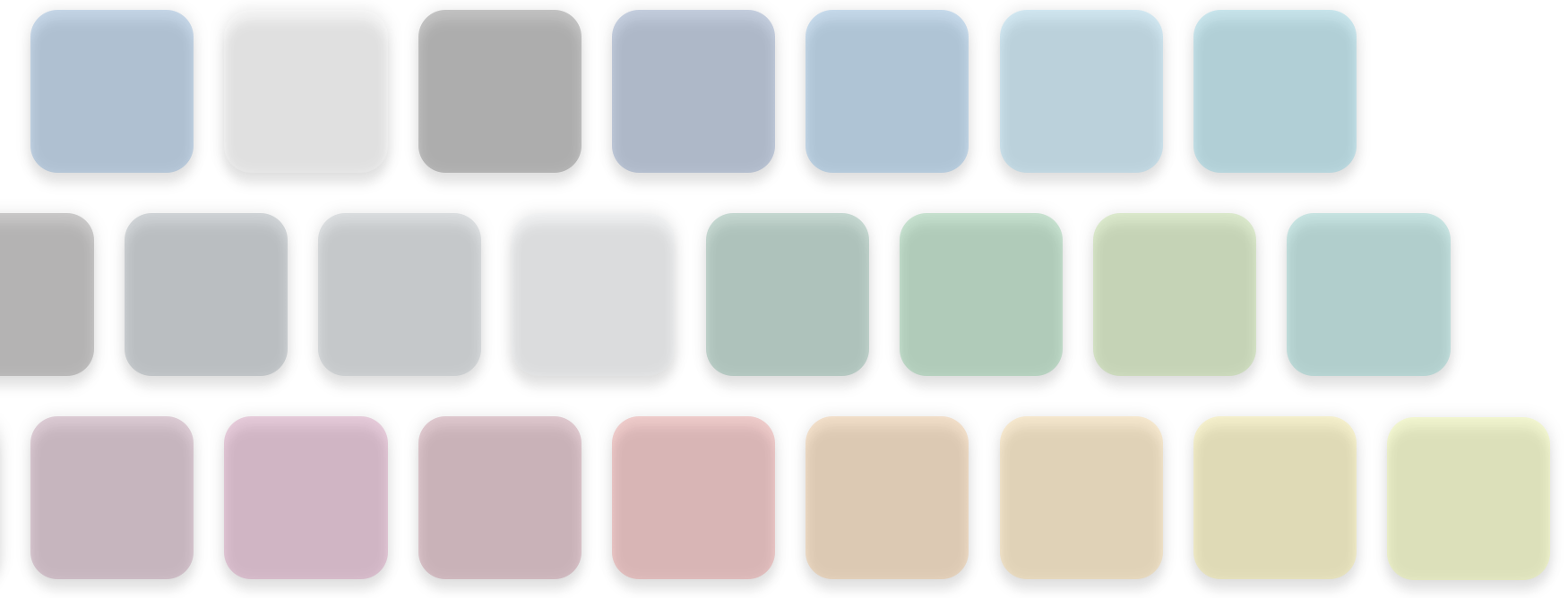
I designed and co-developed an interactive tool to show the organisation’s preferred colours and, once a colour was selected, which of the other colours could be used that permitted a minimum AA level of conformance for colour contrast. All colours were presented with their official name and their hexadecimal colour notation. I also presented examples for each colour with its suggested contrasting colours, and designed the colour hierarchy in-line with the organisation’s preference for frequency (i.e., colours that should be used often vs. those that should be used rarely).

For access to an interactive version of this tool, please get in touch with me.
Impact
The tool was strongly welcomed by user groups, as well as by educational designers and developers. This tool has saved many hours of time, whether implemented from the start of the design process or referred to during build. Given the large number of colleagues working with digital content, this has also been passed to other teams (e.g., online marketing) to both train their staff in this area and to help ensure greater accessibility in their outputs.
⥪ Return to portfolio homepage